The Spire is a mountain of metal and stone that rises out of the middle of the desert, containing a vast city of twisting tunnels, grinding elevators, and ancient machinery, and home to over a million human and non-human residents. Sha, the last of the Medusi, is responsible for keeping watch over them as Commander of the City Watch, despite the fact she isn't shown any respect due to her race. When a string of grisly murders is committed just as a new Baroness of the Spire is about to be sworn in, Sha will have to find the serial killer and bring them to justice. But the new Baroness has a deep hatred of non-humans, and Sha will have more than one enemy at her back.
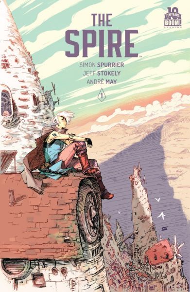
The Spire is a metal city of sorts holding all sorts of people and other stranger things.
The Spire #1 is peculiar. It looks like it belongs on the sci-fi channel as it has a mashup of medieval elements along with sci-fi. The Baron has just died and his daughter will soon be coronated as the Baroness. Sha is in charge of the city watch and unfortunately for her someone important to the new Baroness was murdered in her jurisdiction. There were certainly some elements sci-fi fans could enjoy here, but this sort of sci-fi isn't my thing.
There are so many good things to say about this I'm gonna need to keep organized to get it all down...
The writing: Great! Really. It's hilarious and political and leaves you with a good, creepy mystery that promises to be as engaging as everything else in this first issue.
There are fantasy worlds that have an element of racism to them, but The Spire nails it in dropping readers into a world where racism is built into the system and naturalized; where racist terms are used in everyday speech without a second thought until the speaker is confronted by someone of the non-dominant group - and stammers to correct herself; where the racialized other grits her teeth hearing the way the oppressed are spoken of; where even a higher ranking individual of the minority is constantly made to feel like a fish out of water... I think you get the point. Racism doesn't just exist here. It's real and alive, and it's reflective of people's experiences in the real world. Thank you, Simon Spurrier!
This racism is experienced by our stoically snarky protagonist, Commander/Captain Sha of the City Watch. Sha is unexpectedly entertaining with her determined, take-no-shit, subversive attitude. She does her job, but that doesn't mean she has to take her oppression like a mute lamb. Everything she says is gold. Speaking of... She's a gold star lesbian in what appears to be a healthy relationship with someone who loves her "other"-ness along with the rest of her. Their scene together involves sarcasm and playful banter (okay, fine, and some almost sexy-time), which is always a winning combination in my book. Thanks, again, Spurrier, for more representation! And for a strong female protagonist with an eyepatch!
The lettering: This isn't something I usually pay attention to unless it's horrible enough for me to notice. In this case, it's the opposite. Steve Wands should have his name on the cover with what a superb job he's done. Dialogue placement feels natural, but that's expected. What's over and above is the use of different fonts for the various personalities and species inhabiting the world - of which every font is easily readable. Font sizes change, and darkness/lightness of font colour change, depending on how a character says something. If a single character code-switches, his font style switches with it. If he whispers, the text is grey-coloured and smaller-sized. When he shouts, it's bigger, in black, and in bold. This is lettering! Why haven't I seen anyone else do this before?!
*takes a deep breath*
The art: It matches perfectly, complementing the fantasy world with an art style that could easily be found in a children's fairy tale book. Jeff Stokely's lines are sometimes simple, and other times almost realistically detailed. Andre May's colours are beautiful, from the sepia tones of a flashback, to a green/blue-and-orange toned skyscape, to the grey-brown eeriness of The Smokewood. The art just fits.
The takeaway message: I am thrilled to be reading The Spire. It's smart, funny, mysterious, and set in a fascinating world that feels complex and rich enough to analyze from socio-cultural perspective. I like Sha and want to see what she uncovers as much as I want to learn more about her backstory. There's a lot of attention to detail in this first issue, and it all comes together to form a fantastic book that truly feels special. It feels like the creative team cares about the characters and the story they want to share, and that they care about the people they're sharing that story with.
This was weird. This was so weird, and I sort of have no idea what was going on, and yet I kinda loved it? I dunno, but I'm still thinking about it a week or so later, so its wormed its way into my head... Think I'll be seeking out more of this one.
I have to admit that I made the purchase after reading the words “lesbian cop in dystopian city” and not even finishing the synopsis, but it was a lucky impulse buy.
Spurrier’s world is complex, intriguing and the whole volume is impossible to put down until you read the ending. Plenty of female characters, very much fourth wave. Recommend.
Didn't really do anything for me. The art was great though and I was intrigued by Shå and the potentially interesting political situation. But not enough to pick up the second issue.
Pretty, hazed-out, alien punk feudalism. The plot is interesting if somewhat predictable, and the police grandstanding is cheesy, but those are minor points and the world around them is excellent.
Spire is a post-apocalyptic tale of murder, mystery, cross-class love, mutants and a tenuous peace between warring factions with quite divergent outlooks. Constable Sha, in charge of the City Watch, has to deal with a lot, but when faced with a series of bloody and mysterious murders begin to take place on the eve of the coronation of the new ruler, one who DOESN'T like Sha, she doesn't have much time or room for error. She must figure out what is going on which trying to keep her love affair with the princess under wraps. She already does quite the silent treatment about her mutations, rather unlike all of the other "shaped" that live and love alongside "normal" humans in the gigantic vertical city in the shape of a many-tiered Spire.
Out in the radioactive wasteland, other vassal communities come to pay homage to their new leadership, but can Sha solve these grisly murders before they threaten the very peace of her world? Stokely's scratchy artwork really works here, and Spurrier's plotting, although apparently heavily influenced by a certain Korean revenge film, is solid. An excellent treat, something for everyone here.
*rating is for volume 1, not issue 1 Has a nice Nausicaa of the Valley of the Wind Vibe (if you added more violence). I like the art and main character. The concept was interesting and inviting. The story itself had its negatives. Every 5th word is a swear word, which I do not understand the appeal of/ why the creator felt this fit any of the characters. I was especially turned off with the fact the swears are written as %@(&$^# so I actually didn't know what characters are saying. It made dialogue (which carries a lot of weight in a comic) difficult to read, follow, or enjoy. The story is supposed to be a mystery/detective story with heavily embedded themes of gender, sexuality, and race. The race conflict is blatant and in your face, but also confusing. The world building is not well explained and it was difficult to figure out who thought what and why. Then the detective part failed for me. It was rushed. Too many stories and timelines were overlapping. Then the ending is very sudden and gives you a twist (but not in a good way).
Okay, owning up right now: I am biased. In a lot of ways. Not just because of the beautiful art, but because I am such a sucker for worldbuilding done right that it'll blind me to obvious flaws better than any flash grenade, and this comic's world was rock-solid in an effortless, accessible way. And as Zuzka Namu Jakubkova said in her review, the concept of it, "lesbian cop in dystopian city," hit all the right notes for me. Especially since the couple in this comic is tender and heart-wrenching - I couldn't help but root for a happy ending for them despite the improbability of it.
The plot moved along at a nice clip, with only a few places where it dragged, and each reveal felt realistic, grounded in very human motivations; sure, it was weird, impossible sci-fi, but who cares so long as the human element is there? (Even if the humans were not always, you know. Actually human.) The worldbuilding was fantastically show-don't-tell, leaving you to make observations about the world of The Spire rather than taking your hand and leading you through what the author thought you needed to know for it to make sense (which is why I think a lot of people came away confused), and so many of the panels were worth studying for this sort of information! I wanted to reread it again and again for things that I'd missed.
tl;dr, I was delighted by this series - this is something I'd want to put on my own shelf just so I can take it out and inspect it for inspiration. Slow clap for a wonderful comic.
3.5 stars. This has some pretty ambitious SF world-building, with an engaging murder mystery and above average art. But I couldn't quite follow parts of the story, and the writing in general didn't always live up to the imaginative potential of the other components. Overall, admirable for a unique feel and some interesting concepts.
Buff! No more than 2.5 stars, and boy, that's disappointing.
Still hoping I can get more into this, because the premise is quite attractive. And so seems to be the main character... but the language was really muddy and put me completely off.
I have all the issues waiting, so it better gets better! :P
Really loved this! The art is so particular, and so is the writing. There is some really fabulous world-building, and a plot that is actually intriguing.
A great read to kick off the summer, can't wait to read more.
I genuinely enjoyed this book. Mixing in elements of a typical graphic novel with many serious topics; such as minority identities and sexuality. I will say, however, that this can become a difficult book to read at certain times, as the story can sometimes come off as "boring".
At this point I'm interested in the characters, the politics and the world. I'm just still kind of confused and hopeful that future issues clarify things a little better.
For some reason The Spire #8 doesn't exist on goodreads, and the trade paperback hasn't been released yet, so I'm using #1 as a "read the entire series" review.
I love short-series comic books. They just feel more complete, and often more thought-out than ongoing stories. Yeah, you don't get as much content for as long a time, but there aren't wasted pages and useless fight scenes. Plus the art is consistent. The art was good, it reminded me of some older scifi comics I've read (none coming to mind right now). I liked the design of the creatures and the plotline wasn't too obvious - it's always nice when I don't guess the answer to a mystery 5 issues before the end. Also, I really liked Skå, she's a great character.
This is a review of the full collection, not just issue 1. Goodreads does not yet have the full collection up.
I hope Spurrier and Stokely never stop working together. They create such an amazing stew and play off each other so well. This book is a fantastic mash up of weird fantasy, detective story, political allegory and diverse characters. I would love to see Spurrier return to the world here. His worldbuilding is so complex, I definitely want to see more of the various cultures and their interplay. And it definitely leaves things open to see more Sha's adventures. This would make a fantastic Stumptown like series (different cases for different arcs building up the character and world as we go).
I received this single issue in my Landfallfreight box, July I think. It was a pretty weird read. I am not sure if I like it or not. The colours are pretty muted and the artwork fine but not my usual style. The story was a bit confusing. I'm not sure where our main character came from or really her purpose.there was somewhat of a prologue but it didn't really tell me anything. We get introduced to a butt load of charcaters but nothing really of importance. I did like the LGBTQ aspect in the story. I might read more in this series just to see what the hell is going on.
The art is pretty. I like some of the interesting and unique choices in dialogue and lettering. There are a lot of interesting ideas in this issue. However, I find that it is introducing too many ideas in too few pages, making it a little messy for a first issue, distracting from grabbing the reader with what it's really all about like it should.
This was weird and confusing but beautiful. I really wanted to love it the whole time but I found myself getting lost quite often. I will probably give the second volume a shot just to see where the story goes.